Digital Imaging : Before & After
The Frau Line Banners
The Frau Line project was unique, exciting and challenging. I was approached by a U.S. Air Force fighter pilot who wanted to build a wine brand that was largely sold as care packages to the spouses of those serving our country.
Here is an excerpt from the Frau Line site, to further explain the name and concept:
Frau Line is a salute – a toast to all the loved ones holding it down, keeping the family together, and (of course) putting up with all the fighter pilot lingo. In the fighter jet community, an aviator’s spouse is affectionately referred to as frau. Pilots develop a close bond from the shared experience and demand of flying. The same bond is seen on the homefront, within the extended community that is the frau network. They get each other through the daily grind, the long TDY's, and even longer deployments – this is our family.
After the wine label was designed, I set to work on the web design. I wanted to compliment the ‘vintage national parks’ art theme with the website. Somehow, I wanted to incorporate the legendary P-51 Mustang and B-17 Bomber in the banner images, so I started digging for assets.
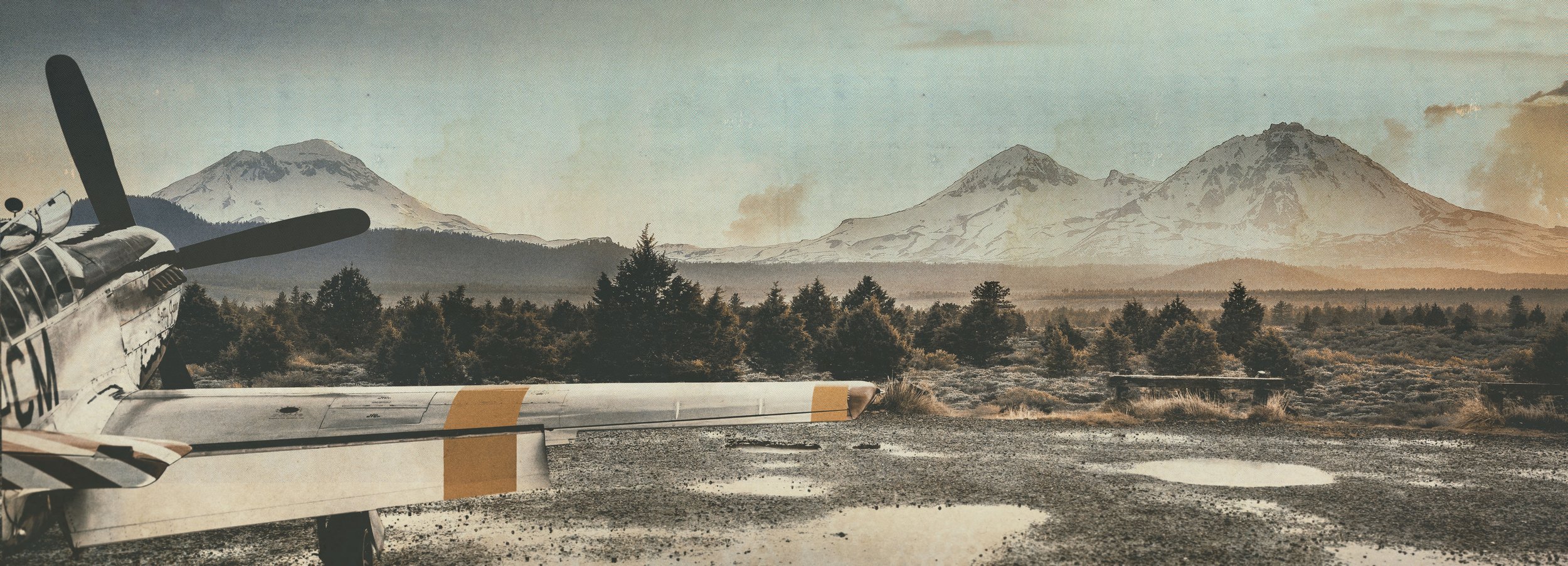
This is the P-51 Mustang I isolated for the main banner.
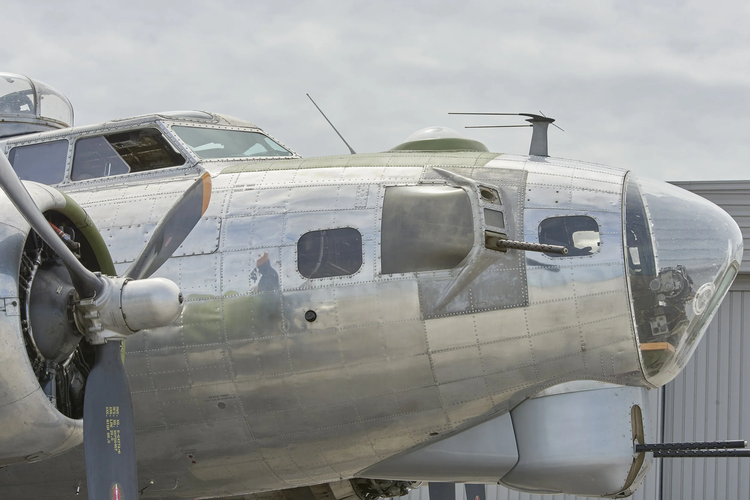
For the second banner, I isolated this B-17 Bomber
This wet gravel parking lot was perfect for the foreground. Besides for the airplanes, I wanted the surrounds to have a very natural feel.
The scrub and mountain range was exactly the backdrop I was looking for. Both of the landscape pictures had a similar scale, which was important when it came time to merge them.
I couldn’t pass up incorporating this art (obviously a wine bottle was a perfect replacement for the bomb).
I went with this texture to give the final image a vintage postcard feel.
I won’t say this was an easy image to pull off. Angles, perspectives, light and color needed a mountain of tweaking. The end result was a hit!


